Cath Kidston
Create a new set of visal identity and brand strategy that modernize the brand without losing its colourful, printed quality unique to Cath Kidston.
Strategy and Branding
April 2021
![]()
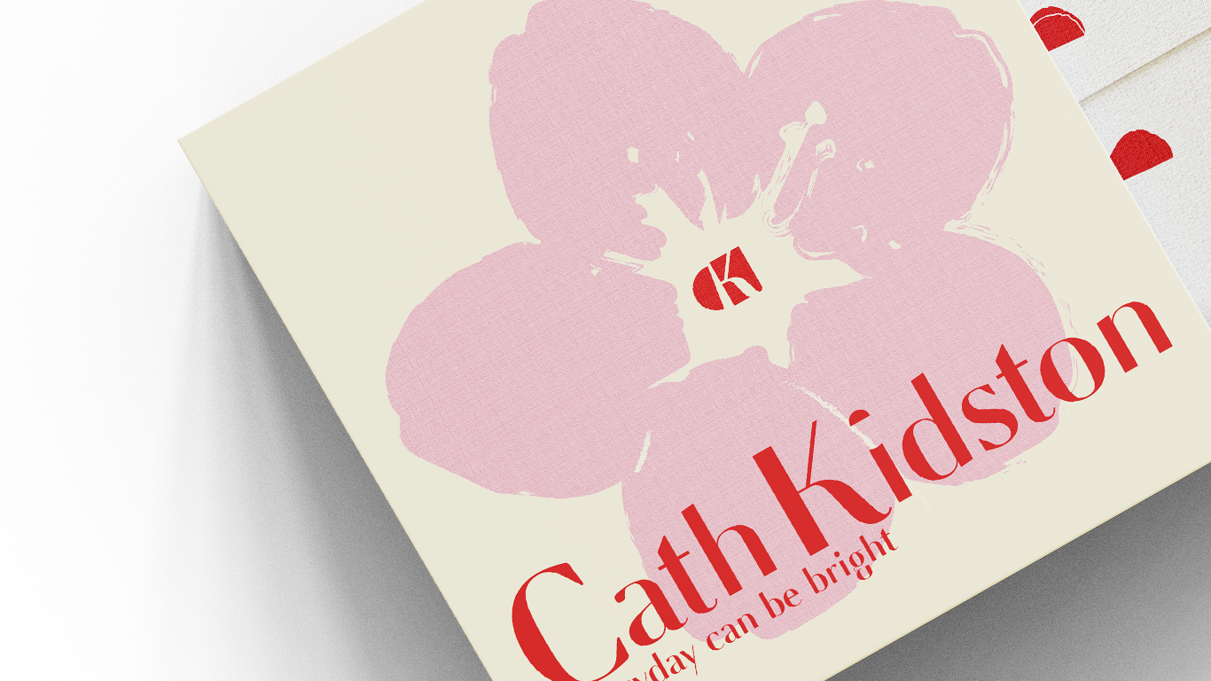
We conducted a thorough research into its market position, competitors, brand values and assets in order to construct a new set of strategy and visual directions︎︎︎
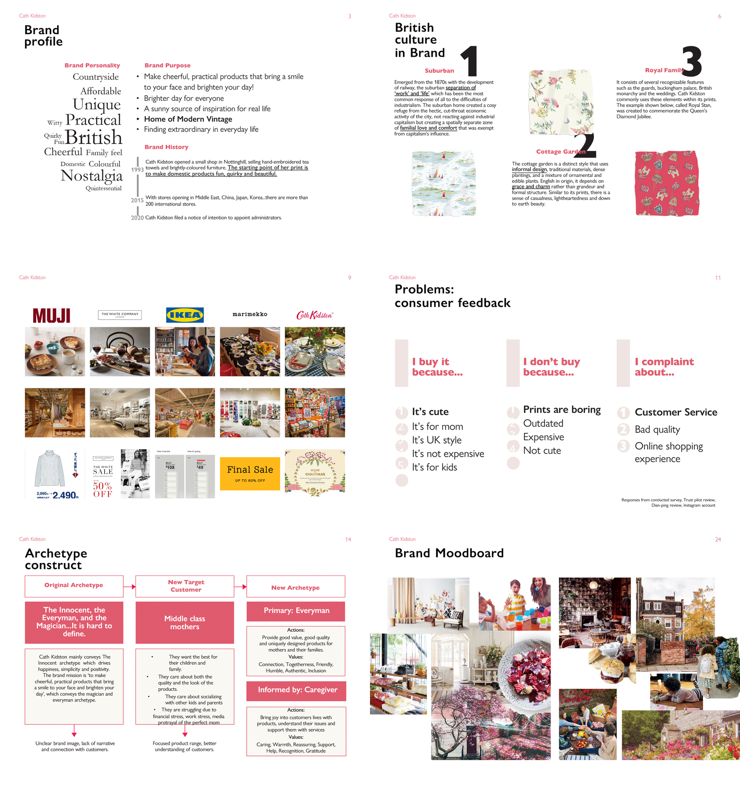
The wordmark was redesigned by referencing Cath Kidston’s original logo, and a lettermark was derived from it︎︎︎
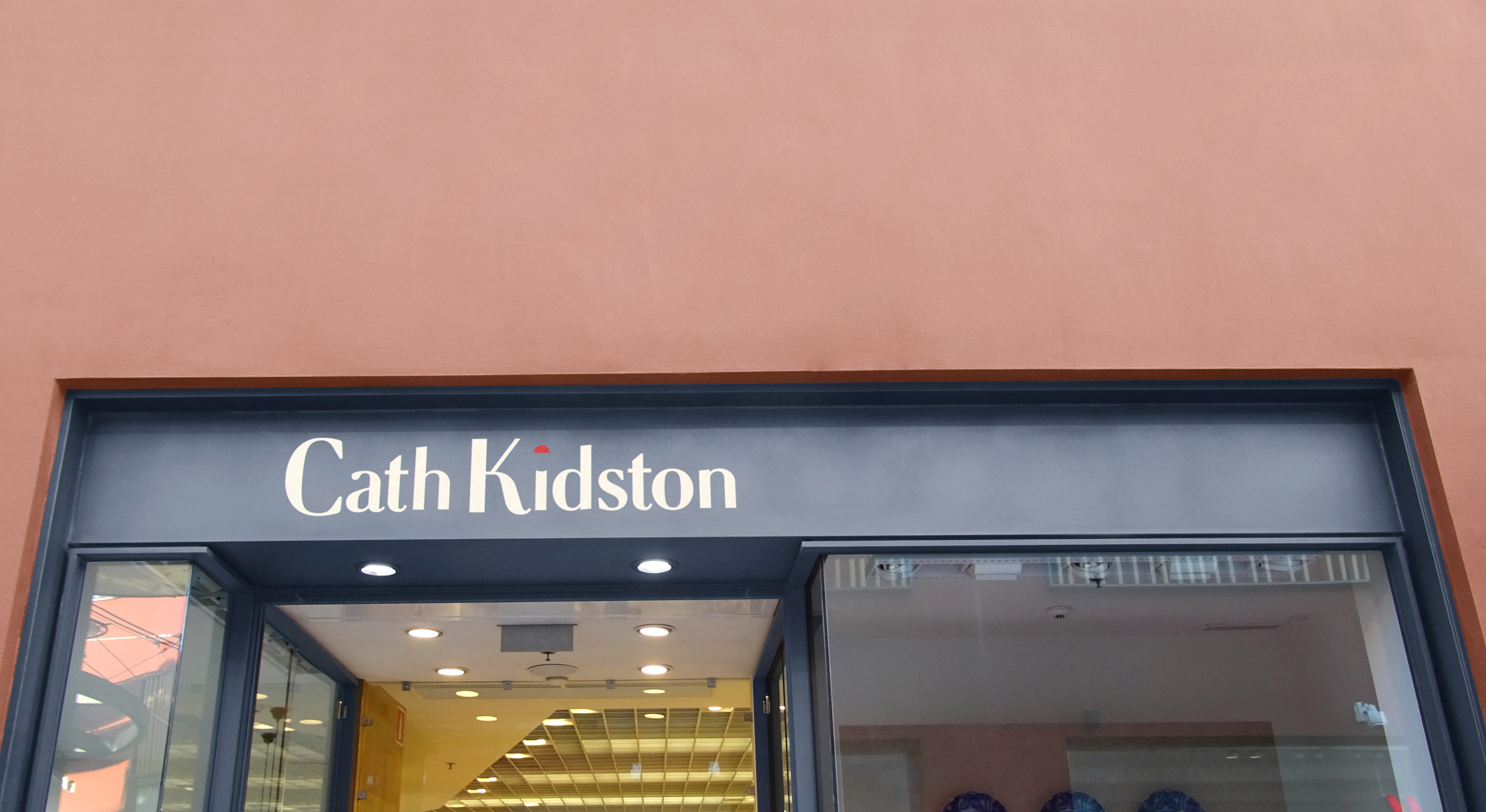
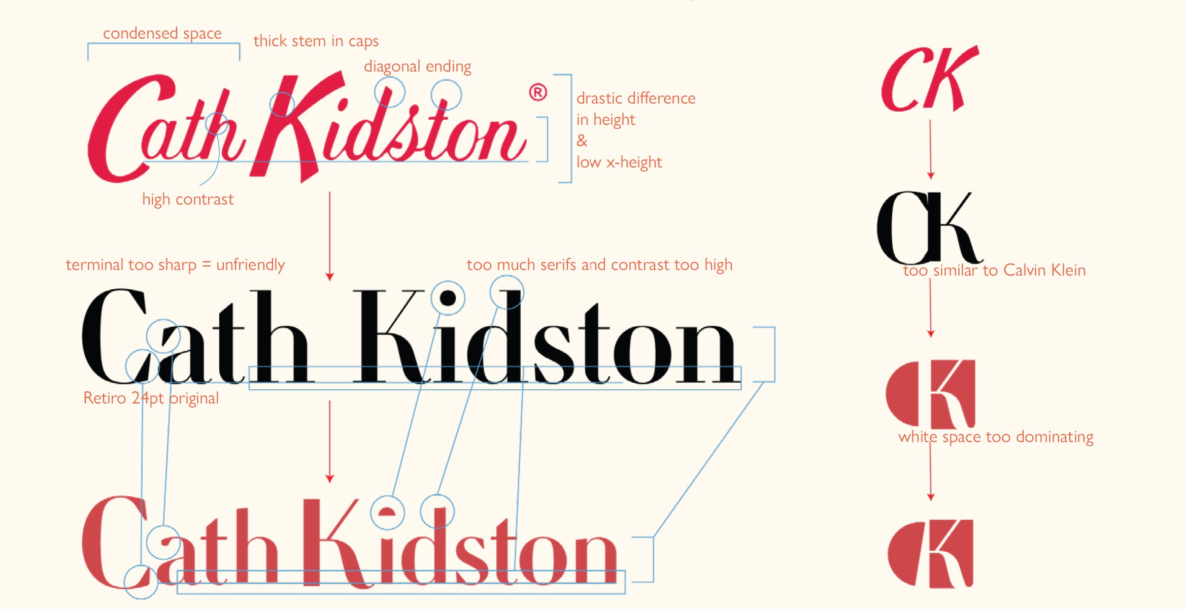

A set of visual elements were extracted from the logo design to use on various applications as patterns.︎︎︎
![]()

The set of visual elements should have the painted/printed quality, and should
be versatile but highly recognizable.
They should not be totally different from what Cath Kidston used to be, but fit
well with the new brand strategy by being more modern and mature.
They should go well with all kinds of different product patterns and artists collaborations.
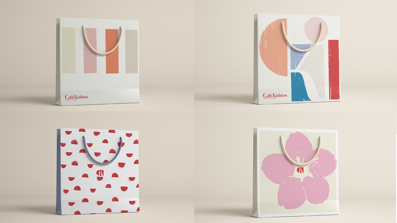
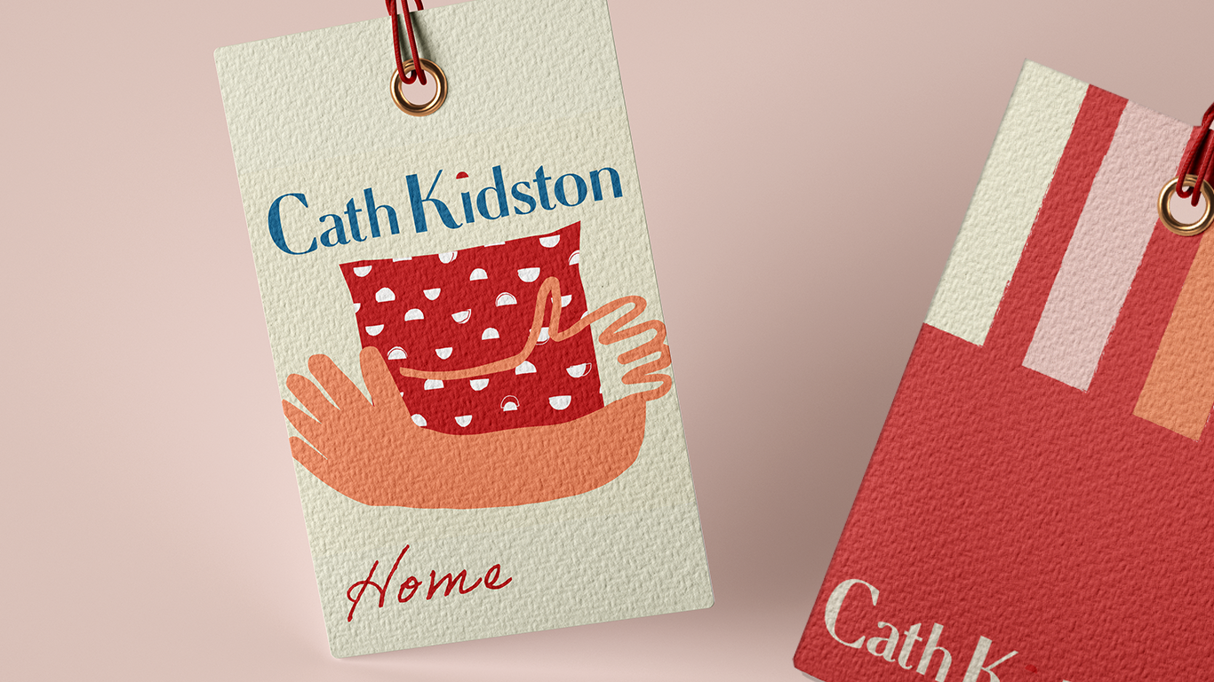
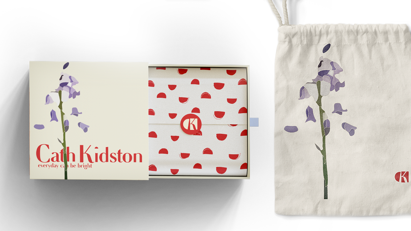
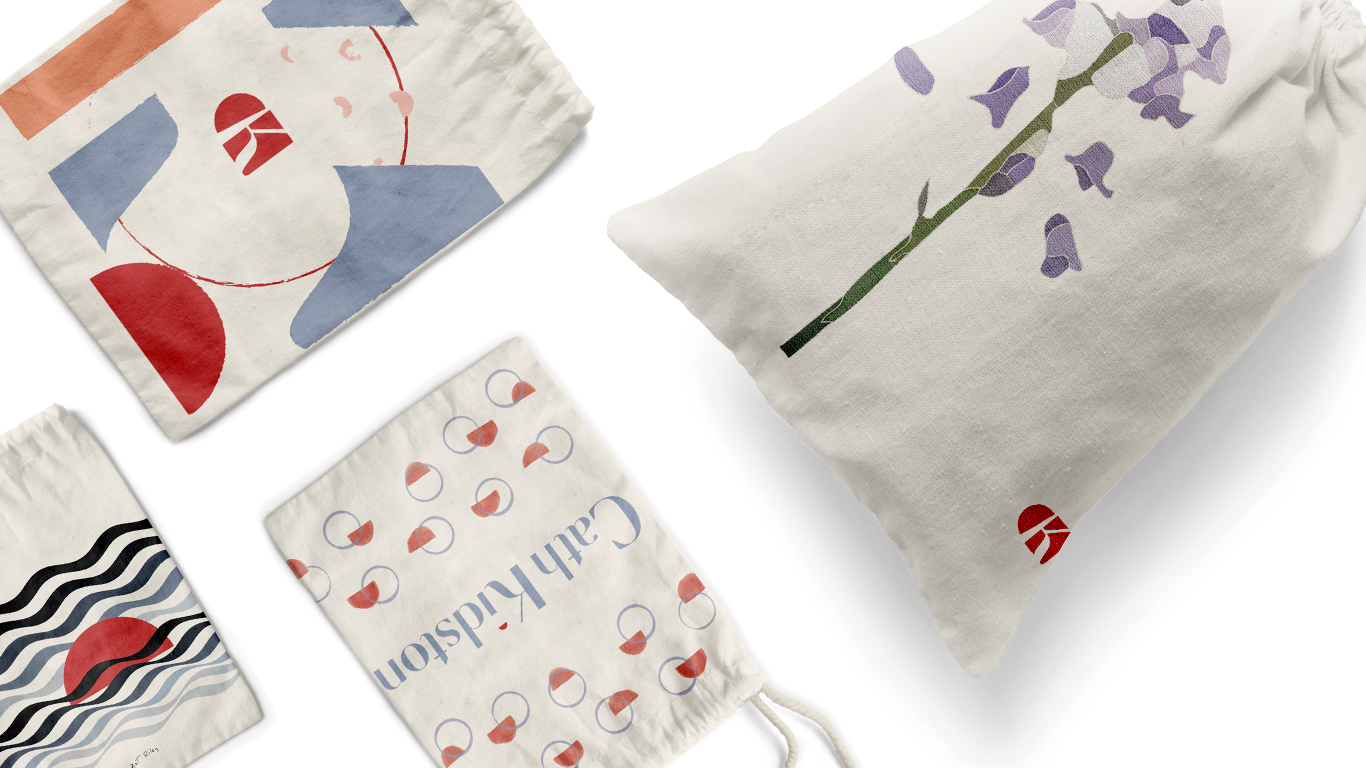
The brand could be collaborating with differnt print and pattern artists/designers to make its products more versatile.
With artists collaborations, there will be different packaging and campaigns, emphasizing the style of the collaborator.︎︎︎


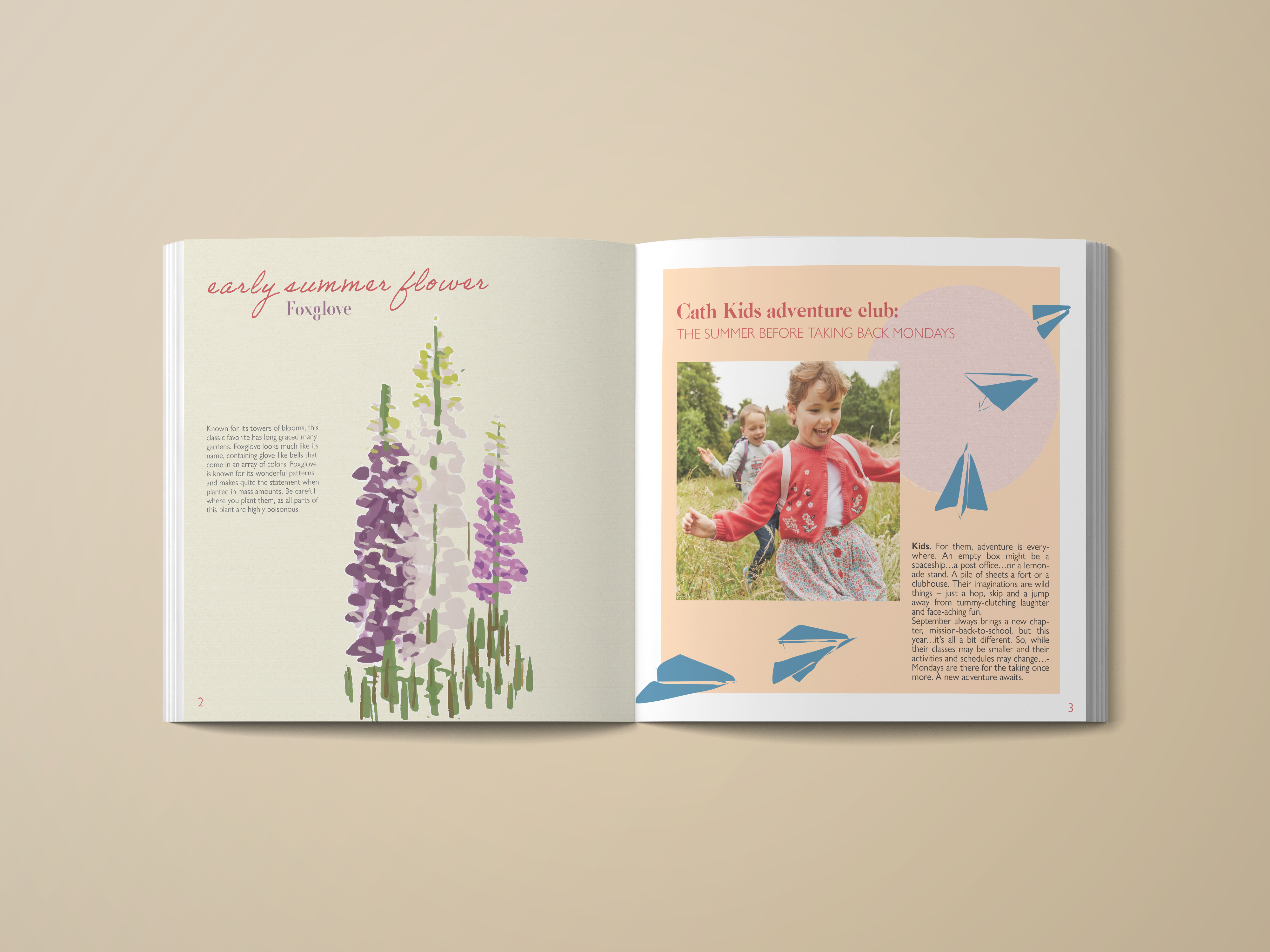
Build community within the customer base and provide them with a platform for communication with publications and workshops︎︎︎

